Introduction
Following our previous article about the power of a great story in business and the importance of controlling your own domain, we’re going to explore how to translate a good story into a great landing page.
(Un?)fortunately, your e-store is not the place to express your creativity. Well, you could, if you want. After all, it’s your e-store! Do whatever you want with it! However, certain rules are now standards. For example, the cart on the top right corner is now the ONLY position where you want it. Everybody expects the cart to be there. Don’t go and try to change these conventions a the risk of confusing the customer – and a confused customer is never a good thing!
Six Points to Keep in Mind While Creating a Great Landing Page
If you want a successful e-store that SELLS, however, then you better base yourself on the decades of research available on what creates the most conversions. Below is a summary of a lot of techniques in place. After checking the analysis below, you’ll notice how it’s used in many sites or big-name stores. It’s been proven to work!
Note: this applies mainly for selling goods. Services would have a different type of landing page.
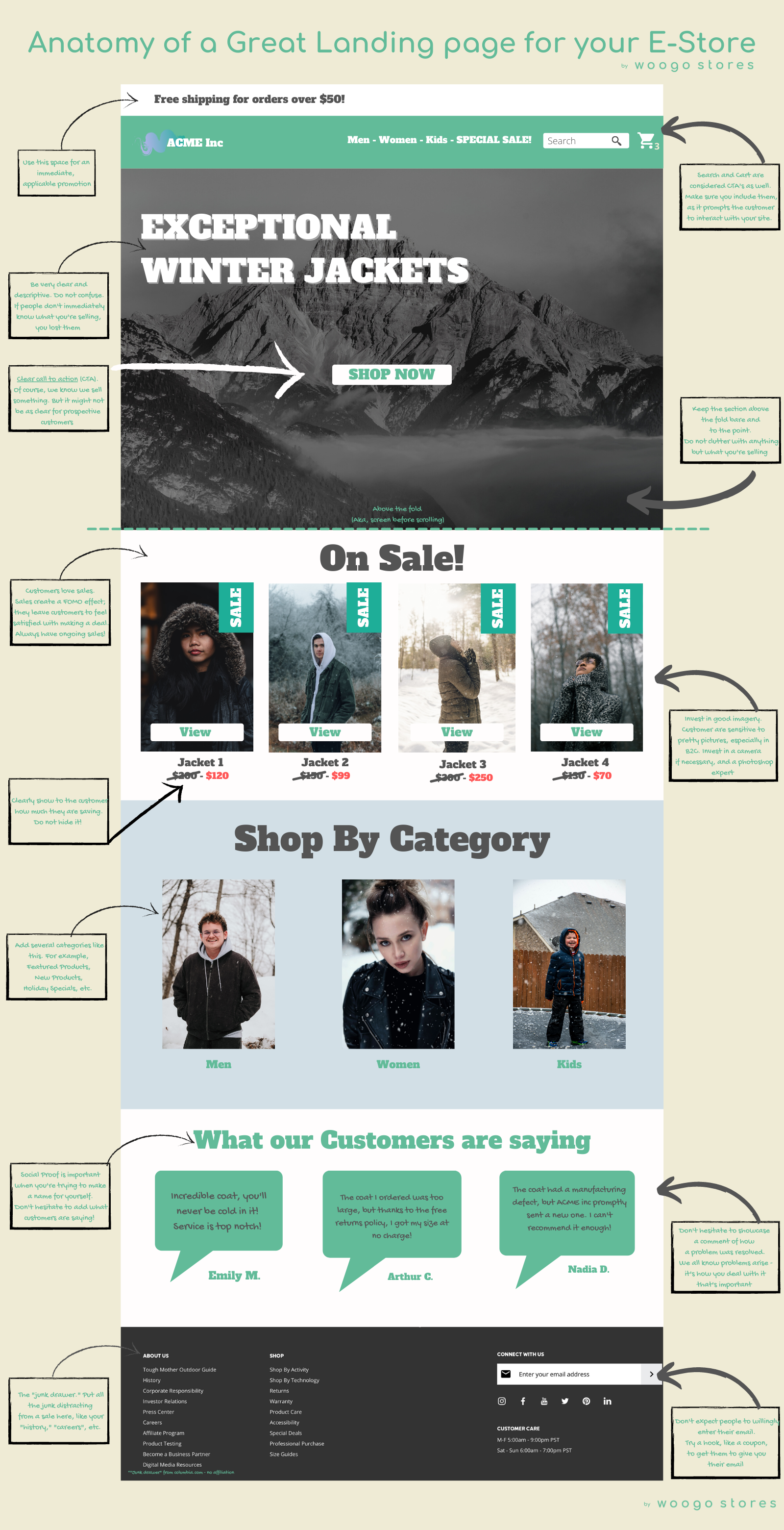
#1 Use the top banner to offer a promotion
Free shipping. A special for a holiday. Anything that is either time-sensitive or free is a good idea to grab attention. There is nothing that customers love more than something “free” – even if it means they gotta spend $50 to get it. We’re weirdly wired that way…
#2 Have a crystal clear header
This cannot be emphasized enough. So many landing pages have lofty texts that don’t describe what you’re selling. It’s obvious to you, but it’s not obvious to your customer (yet), and you have less than a second to get your message across before your customer loses interest.
Nike can get away with “Just do it” as a slogan because everybody KNOWS what they are selling. They don’t need to market it. Unlike big household brands, you need to market what you’re selling, telling it as it is.
Consider the example below. “Exceptional Winter Jackets.” It’s nothing fancy, but you know in 3 words what I’m selling. If you go with a “fancy” description – for example, “Keep winter out and warm your soul” – it means nothing.
Stick to pragmatic – that’s what your prospects want.
#3 Have an obvious call to action (CTA)
“Shop now.” There is nothing more obvious than that! Of course, you know it’s an e-store, but your prospect might not. This reinforces the psychology that the only action you want them to take is to Shop. Now.
#4 Keep the Above-the-fold section Clean
Keep it as pure and simple as necessary. Don’t add clutter in there – it distracts the eye and ultimately confuses the prospect. Keep in mind; prospects do NOT want to expend mental energy on your site, so you have to pre-feed them what you want in tiny doses.
#5 Showcase what’s on sale
Why is it great to have sales on landing pages? Because it creates a Fear of Missing out (FOMO) for the customer. What if the sales end tomorrow? Tonight? It encourages customers to spend now instead of waiting.
We always recommend having at least a few items on sale on rotation. Don’t make fake sales where you have the item at the same price 365/7 – people will catch on, and it’s not great for your reputation or the value proposition. But small sales in rotation or for special occasions are definitely recommended.
#6 Social Proof – Show testimonials
Testimonials are key. According to Nielsen’s study – 70% of people tend to trust recommendations from people…they don’t even know. Get real recommendations from real customers – it validates your brand in the eye of the prospect that you’re legitimate.
What Creates A Great Landing Page – The Cheatsheet
If you’re looking for a Done-for-you solution for your e-store, we provide a full concierge service for our customers, using the best technologies available!
If you’re interested in knowing more about how to build an e-store, consider subscribing to our newsletter below.
